
There are few filmmakers whose work is so visually distinct that it becomes an adjective. To see a perfectly centered shot, a deadpan expression, or a quirky vintage font is to see something "Wes Anderson-esque." But more than any other element, his signature is color.
His films don't just use color; they are built from it. Each frame is a meticulously crafted painting where the palette is the primary language, communicating mood, theme, and character before a single line of dialogue is spoken.
The 6th Bureau has undertaken the task of declassifying this visual language. Here is our official dossier on the director's most iconic color palettes.
The Royal Tenenbaums (2001)

The aesthetic here is faded glory and melancholy nostalgia. The iconic red of the Adidas tracksuits provides a vibrant spark of arrested development against the muted, academic browns and soft blues of the family home.
Tenenbaum Red: #b91c1c-
Archive Brown: #78350f Vintage Blue: #60a5fa-
Margot's Guyliner: #292524
The Life Aquatic with Steve Zissou (2004)

This film feels like a faded 1970s documentary. The palette is built on the Belafonte’s soft, institutional blues and yellows. Against this, the iconic red of the Zissou beanies pops with defiant energy—a tiny beacon of passion in a vast, indifferent ocean.
Zissou Red: #ef4444Belafonte Blue: #93c5fdSubmarine Yellow: #fef08aSeafoam Green: #6ee7b7
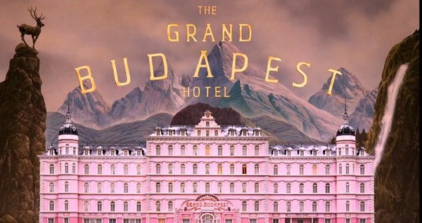
The Grand Budapest Hotel (2014)

This is Anderson's most famous palette, a confectionery creation told in shades of pink, purple, and rich, decadent red. It's a story of beauty versus brutality, told entirely through color.
Grand Budapest Pink: #fbcfe8Lobby Boy Purple: #9333ea-
Society Red: #dc2626 Mendl's Blue: #67e8f9
Asteroid City (2023)

Asteroid City is a postcard from a retro-futuristic past that never existed. The palette is a masterful blend of sun-bleached desert tones and the artificial pop of 1950s Americana. The film is dominated by a dreamy, desaturated teal and a warm, dusty orange, creating a world that feels both nostalgic and strangely alien-a perfect visual metaphor for the film's themes of memory, grief, and the search for meaning in the cosmos.
Desert Teal: #14b8a6Asteroid Orange: #f97316Parched Yellow: #facc15Diner Mint: #a7f3d0
The Challenge: Find This Aesthetic in the Wild
Now that this intelligence has been declassified, The 6th Bureau is officially launching a new field operation.
Your Mission: Find the Wes Anderson aesthetic in your world. Take a photo that perfectly captures one of these palettes. Post it to your Instagram story and tag our official account, @the6thbureau. The best field reports will be featured in our official story archive. The operation is a go.